A beautiful collision of data
Last week, I had the pleasure of sitting on a NAAEE webinar where the creators of Resource Watch presented their new website.
When thinking about the amount of data available in the web-i-verse, it creates similar feelings of anxiety when trying to comprehend the size of the Milky Way Galaxy (let alone the universe). By the way... nerd moment... the Milky Way Galaxy is roughly 100,000 light years across. It takes about 250 million years for our solar system to rotate around the Milky Way.
Returning from the nerd moment, so what do you do with data overload? I believe Resource Watch has a beautiful answer to this question - https://resourcewatch.org/. Honestly, I feel it's better to let the website speak for itself so I'll just provide some of the highlights I found to be interesting.
- The Topics: These are curated topics providing a snapshot of relevant information. Here is an example of one created for the One World Ocean (https://resourcewatch.org/topics/ocean).
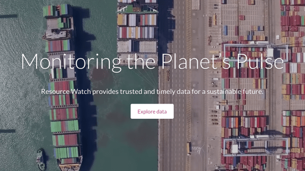
- The Planet Pulse: Instead of seeing old boring data (btw there’s no such thing), would you rather see what's happening now on our planet? Here's your chance, https://resourcewatch.org/data/pulse.
- Dashboards: Here is where they listened and actually worked with educators to create tools for educators of all sorts. If you sign up to their website, you'll be able to curate your own material that you can then share with others (e.g., students). You can combine material and content from other resources all into one location. Here's an example of where I embedded a tool from NOAA's Digital Coast, https://resourcewatch.org/data/dashboards/risk-communication-for-coastal-communities.
These highlights are only scratching the surface. I strongly encourage you to check out their datasets section and play around building different maps. The customizability is crazy cool. In summation, let Resource Watch begin to wash away the anxiety of all that data.
Comments
Wow, these maps are beautiful! Thanks for sharing this followup to the webinar. I can totally see incorporating any of these resources (tree cover, wetlands, eco-regions, and probably others) to enhance our physical and life sciences curriculum. I see the biggest benefit of integrated web maps in my teaching as giving people a greater connection to what they are seeing (i.e. interpreting data) which I think is valuable.